 css中的border-style渲染结果固定,并且不同浏览器中的表现也可能不一样,这带来许多不便。
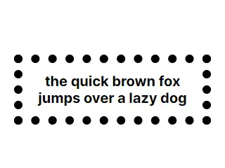
例如,有时候我们希望圆点边框更加密集,然而此间距与border-width绑定。
这类边框,需要全边联动的效果,才不显得突兀。因此,我们可以借助SVG中stroke的良好可自定义性,通过background绘制边框。
1
2
3
4
5background:
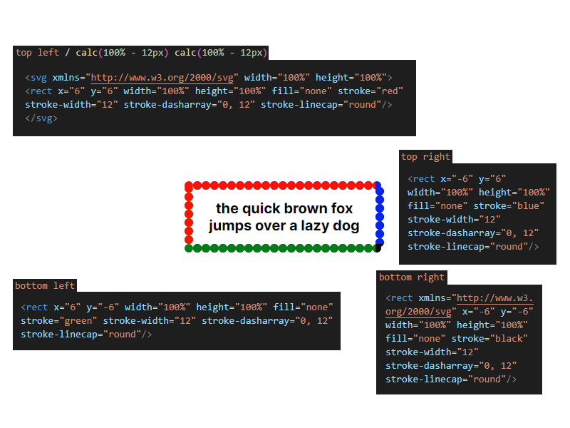
url("data:image/svg+xml,%3csvg width='100%' height='100%' xmlns='http://www.w3.org/2000/svg'%3e%3crect x='6' y='6' width='100%' height='100%' fill='none' stroke='black' stroke-width='12' stroke-dasharray='0%2c 12' stroke-linecap='round'/%3e%3c/svg%3e") top left / calc(100% - 12px) calc(100% - 12px) no-repeat,
url("data:image/svg+xml,%3csvg width='100% ' height='100%' xmlns='http://www.w3.org/2000/svg'%3e%3crect x='-6' y='6' width='100%' height='100%' fill='none' stroke='black' stroke-width='12' stroke-dasharray='0%2c 12' stroke-linecap='round'/%3e%3c/svg%3e") top right / calc(100% - 12px) calc(100% - 12px) no-repeat,
url("data:image/svg+xml,%3csvg width='100% ' height='100%' xmlns='http://www.w3.org/2000/svg'%3e%3crect x='6' y='-6' width='100%' height='100%' fill='none' stroke='black' stroke-width='12' stroke-dasharray='0%2c 12' stroke-linecap='round'/%3e%3c/svg%3e") bottom left / calc(100% - 12px) calc(100% - 12px) no-repeat,
url("data:image/svg+xml,%3csvg width='100% ' height='100%' xmlns='http://www.w3.org/2000/svg'%3e%3crect x='-6' y='-6' width='100%' height='100%' fill='none' stroke='black' stroke-width='12' stroke-dasharray='0%2c 12' stroke-linecap='round'/%3e%3c/svg%3e") bottom right / calc(100% - 12px) calc(100% - 12px) no-repeat;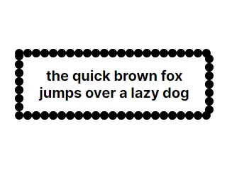 此“边框”由裁切的四部分互相补充而成,他们在形状上是完全相同的,但位置不一样,因此可以在裁切后完美组合起来。不使用单个矩形是因为使用CSS设置样式(calc)在SVG中兼容性不佳,并且双calc()会出现问题,否则我们可以直接绘制一个固定边距的矩形。
我们可以通过stroke-linecap(线帽形状)、stroke-dasharray(虚线长度)、stroke-width(线宽)改变形状,通过rx、ry和border-radius应用圆角。
例如,在此处,线帽为圆形,虚线长度为0px,间隔为12px,线宽为12px,因此呈现出数个圆点。同时仅保留每个部分的一角。
可以到这里生成:CustomBorder
目录